

It’s a bad day
to be a pie.
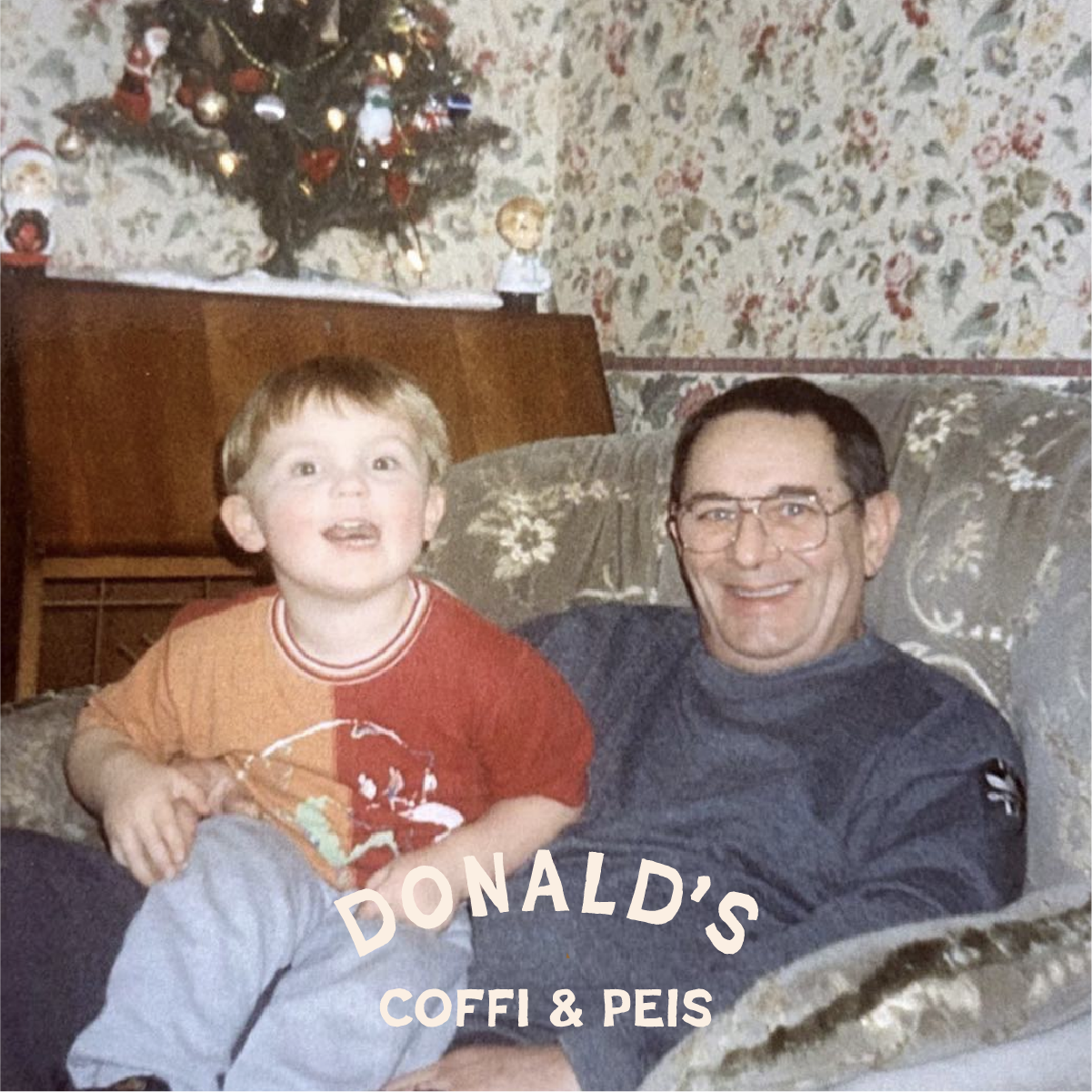
There are passion projects, then there are passion projects, Donald’s sits firmly in the latter. The client had a dream to open a pie and coffee van dedicated to his grandfather, Donald.
Nostalgia is a potent thing, and the brand identity for Donald’s is full of it. From the logo illustration, typeface selection to the tone of voice each aspect of the brand was chosen to feel like a cheerful reminder of great times.

The main logo for Donald’s is Donald himself. The illustration style takes influence from classic American cartoons* such as Top Cat and Sgt Bilko. More than anything the logo is designed to be memorable; a memorial to the great man and the pride he has for his grandson.
*Including the most famous animation duo of all time William Hanna and Joseph Barbera

For a slice of classic retro, Poster Cut Neue doubles down on the nostalgia. We wanted something hand drawn to reflect the uniqueness of each of Donald’s handmade pies and the relaxed, informal tone of voice. The headline typeface is supported by the Amercan Typewriter* family which adds to the classic 1950’s aesthetic, the heyday of fast food and rock and roll.
*Famously used by Milton Glaser for his I♥NY logo


The brand design included suite of supporting graphics and logo alternates. The secondary logo is the “card-trick” which boldly presents the company name and continues the 50’s americana theme.

If you ask someone what’s their favourite colour, it’s probably not going to be brown. The upside of this is that not many companies have used brown as a signature brand colour (UPS’s wonderful brown shorts come to mind).
Donald’s have embraced brown, as the colour of their best selling meat pies and damn good coffee*, it was an absolute no-brainer. Served up with cream it’s a combination match made in heaven. Secondary colours were also included, a strong yellow for drawing attention and a charcoal black for text legibility.
*Any excuse to shoehorn a Twin Peaks reference in
When it comes to vans there aren’t many as iconic as the Citroën H Van, with it’s corrugated panels and retro continental style. Part of the brief was to design the livery of the Donald’s van. After spending a weekend painting it fluorescent orange (it didn’t dry a darker shade…) we had a local signwriter* bring the brand to life.
*Shout out to Sam Evans at Tiger Bay Signs

It was a privilege to work on a project with so much emotional meaning to it’s owner and it has been wonderful to watch Donald’s grow from strength to strength*. Here’s to Donald!
*Check out the latest with Donald’s

Want to make magic with us?