

A forgotten outdoor brand,
a pile of rocks on a mountain
and an old Welsh folk tale
about a faithful dog
This is a conceptual branding project for Gelert, a Welsh outdoors apparel company typically associated with cheap waterproofs and tattered festival tents. The rebrand was aimed to re-establish the company as a contemporary, fashionable yet dependable brand to appeal to outdoor enthusiasts.
The new identity has been built around the legendary story of Gelert, a dog who protected the King of Wales’ baby from a ferocious wolf*. By distilling the ancient myth of Gelert to a mantra of Trust, Protection and Legend, the new brand was rooted in the landscape and mystique of the Welsh mountains, the most extreme of testing grounds.
*Like most Welsh folk stories, the story of Gelert is a pretty tragic


The Ordovician* rocks which form the mountains of Eryri have been folded, faulted and weathered to form a distinctive, craggy landscape. Large elongated slabs balance precariously to create otherworldly forms. An example of this is “Y Gwyliwr” (the Sentinel), a striking rock formation on Glyder Fach which forms the basis of the new Gelert logo. The logo incorporates Gelert the dog watching over a cradle which forms a G shape and establishes the sense of protection and trust.
*The Ordovician refers to a geological period (485-443 million years ago) named after a fierce ancient tribe whose lands included the mountains of Eryri.


A saturated purple was chosen as the principal colour for the brand. The colour purple has historic and cultural associations to royalty. This is due to the use of rare and expensive Tyrian Purple dye, made from the secretions of sea snails, that was the colour of choice from Roman magistrates, Catholic Bishops and Japanese Emperors*. The royal connection links to King Llywelyn and the story of Gelert and has strong associations to rarity, luxury and mythology.
*Here’s a nice primer on the meaning of different colours in Japanese culture
The typeface used for the logo is Harfang, created by PSY/OPS type foundry. The robust, overhanging serifs have a rockface-like angularity, mirroring the shape of the dog in the logomark . This is partnered with Century Gothic* for its no-nonsense readability.
*Not your Robert Smith kind of gothic, but referring to a typographical style without serif embelishments.

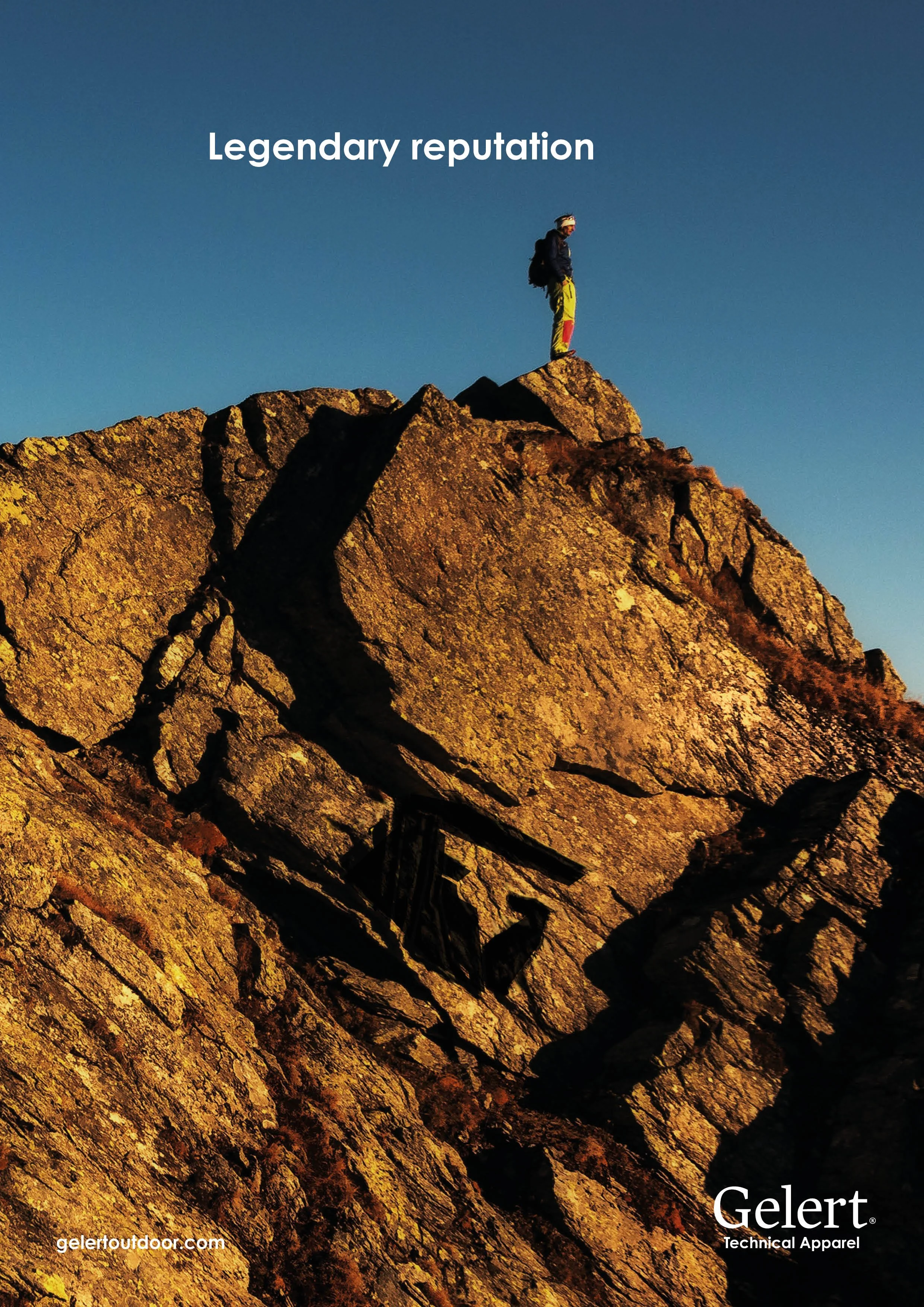
The new brand direction was announced with a promotion campaign. This comprised a series of posters in which the Gelert logo was hidden in the landscape, implying that the brand is a protective, watchful force in the outdoors community. These were placed in well-established outdoor-focused magazines* with a knowledgeble and discerning readership.
*Such as Outside Magazine


A new website was created for the brand. The site uses high-quality mountain photography* with paired-back negative space and subtle angular lines extracted from the logo. The result is a balanced, minimalist and upmarket-feeling website that clearly presents the products whilst subtly telling the story of the brand.
*Prepare for your mind to be blown by the work of Jimmy Chin
Want to make magic with us?